Paint by Numbers Guides
A Creovia beginner guide
Why Do Paint by Numbers Colors Look Different After Drying?
Acrylic paint can shift in appearance as it dries. Here is how to compare a color fairly, avoid overcorrecting it, and check a paint-by-numbers kit...
Why Do Paint by Numbers Colors Look Different After Drying?
Acrylic paint can look one way in the pot, another way on a wet brush, and slightly different again once it dries. If a numbered section looks lighter or more muted after you finish it, that does not automatically mean you picked the wrong color. It may be a normal change in how the paint film looks as it dries, or it may be the room light, a thick coat, or a mismatch in the paint number.
The useful question is not simply “Did the color change?” It is “Did it change in a way that still fits the key and the surrounding picture?” I’d check those things before adding another layer or trying to mix a correction. A quick, careful check can keep one uncertain patch from turning into a larger repair.
Why acrylic paint can change as it dries
Water-based acrylic paint contains pigment, binder, and water. While the paint is wet, the water and acrylic emulsion can give it a slightly cloudy or milky look. As water evaporates, the binder forms a clearer film around the pigment. That shift can make a color’s value look deeper once dry. The effect is often called wet-to-dry color shift.
Liquitex describes this change in its acrylic paint explanation: wet acrylic can appear milky and lighten the color, then look darker as the binder clears. It also notes that the shift is more noticeable in some dark, transparent pigments and less noticeable in lighter, more opaque pigments. That is a general explanation of acrylic behavior, not a guarantee about the exact paint in every craft kit. Formulas vary, so use your kit’s own instructions and judge the finished area on its own terms.
Opacity matters, but it is only part of the picture. A thin coat lets more of the canvas show through than a thicker coat. The canvas color, the light in the room, and the amount of water on the brush can also affect what you see. Two nearby colors may seem more different while wet and closer after they dry—or the reverse.

Check the color before you correct it
1. Let the section dry fully
Do not compare a wet patch with a dry one and call that a final color mismatch. Give the area the time your kit instructions recommend. A thick dab may take longer than a thin coat, and a cool or humid room can change how quickly moisture leaves the paint. Avoid touching a section just to test it; a fingerprint or sleeve can leave a mark while the film is still soft.
2. Use the same light for both comparisons
Warm bulbs can make cream, yellow, and red areas look warmer. A bright window may make colors appear cooler or wash them out. Move the canvas to a place with even daylight if practical, or compare it under the same room light each time. Turn off a nearby colored lamp and avoid judging a glossy wet patch from an angle where it reflects the light source.
Photos are useful for documenting a concern, but they are not a perfect color meter. Phone cameras adjust exposure and white balance automatically, and screens display color differently. If you contact the seller, include the design, the paint number, and a photo taken in even light; describe what looks different rather than relying on the image alone.
3. Check the symbol and paint number again
Similar shades can sit close together in a chart. Match the canvas symbol to the key, then check the label on the paint pot. If you are unsure how the chart works, our paint by numbers color key guide walks through matching a symbol to its paint number.
Also look at the boundary around the section. If the color itself seems plausible but the edge looks muddy, the issue may be a small overlap rather than the wrong pot. Our guide to blending paint by numbers colors explains when soft transitions make sense and when it is better to keep numbered areas separate.
What can make a dry color look unexpectedly different?
- A thick or uneven coat: More paint can dry with a different surface texture and apparent depth than a thin, smooth layer.
- Different lighting: A color can change in appearance between daylight, warm indoor bulbs, and a camera screen.
- Wet paint next to dry paint: The contrast can make the dry area seem duller or more intense than it looks on its own.
- Brush moisture: Extra water can alter the paint’s coverage and how it sits on the canvas. Follow the kit directions rather than adding water by default.
- A numbering mix-up: When colors are similar, checking the key and pot label again is more reliable than guessing from memory.
If the surface has dried and the number still seems clearly out of place, pause before mixing a new shade. A change that looks small on one patch can stand out more after the whole image is complete. Save a clear photo and ask the seller about that numbered color; do not assume every kit uses the same paint formula or color reference.

Choose a design with a palette you will enjoy
When selecting a paint by numbers kit, the artwork preview gives you a sense of its palette, but the finished paint can vary slightly with lighting and application. If you prefer cool blues and greens, a mountain river scene may feel different to work on than a bright café street or a tropical pink stairway. Creovia’s current listings show a 15.7 × 19.7 in / 40 × 50 cm numbered linen canvas with 24, 36, or 48 pre-mixed acrylic colors; available frame choices are listed on each product page and can vary by selection.
For a closer look at the designs and their current options, browse the Paint by Numbers collection, or compare these three scenes:
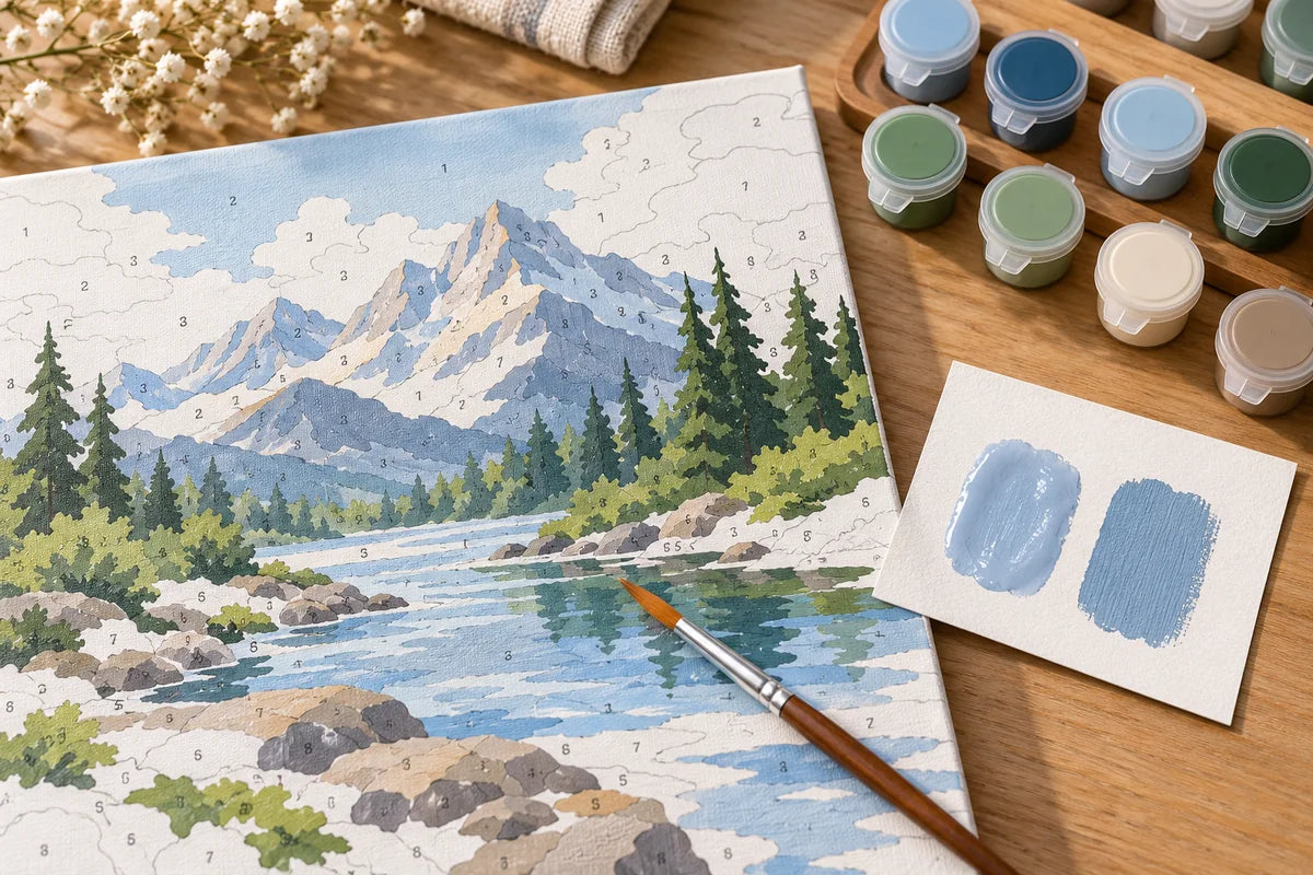
- Snowy Mountain River Paint by Numbers Kit — an alpine landscape with cool water and evergreen tones.
- Colorful Café Street Paint by Numbers Kit — a colorful old-town lane with warm buildings and a café setting.
- Tropical Pink Stairway Paint by Numbers Kit — a vivid stairway scene with pink architecture and tropical greenery.
Check each listing for the current canvas and frame options before ordering. The product pages are the source for what is included in each selection.
A simple way to decide whether to leave it or ask for help
When a color surprises you, I’d work through a short sequence: let it dry, view it in even light, recheck the symbol and pot, then compare it with the nearby artwork. If it still looks wrong, stop there and ask for guidance with the paint number and a clear photo. That is usually more useful than repainting several areas based on a wet-to-dry comparison.
Acrylic color shift is a real feature of the medium, but it is not the only reason a section may look different. A consistent light source, the numbered key, and the product’s own instructions give you a better basis for deciding what to do next.
Frequently Asked Questions
Why does acrylic paint look lighter when it is wet?
Water in an acrylic emulsion can make wet paint look slightly milky. As water evaporates and the binder clears, the color can appear deeper. How noticeable that is depends on the paint formulation and pigment.
Do paint by numbers colors always get darker after drying?
No. Some colors show a clear wet-to-dry shift, while others change very little. Light, opaque pigments may look steadier than darker, more transparent pigments, and different paint formulas behave differently.
How long should I wait before judging a paint by numbers color?
Follow the drying guidance supplied with your kit and wait until the painted area is fully dry. Room temperature, airflow, paint thickness, and the surface can affect drying, so one fixed time does not fit every project.
Can I repaint a paint by numbers section if the dry color looks wrong?
First confirm that the section is dry, compare it in neutral light, and check the matching number on the color key. If it still appears inconsistent, use the kit instructions and contact the seller with the design, paint number, and a clear photo before changing the color.
What is the fairest way to compare a wet and dry paint color?
Look at the same area under the same light after it has dried. A small swatch on a similar spare surface can help, but a different surface may change the result, so treat it as an approximate comparison.
Why does my finished paint by numbers picture look different in photos?
Phone screens, automatic exposure, warm room lighting, and reflections can shift how colors appear in a photo. Compare the canvas in person under even, neutral light before deciding that a paint color is incorrect.
Further reading
For a general explanation of acrylic paint, read Liquitex’s overview of acrylic paint and wet-to-dry color shift. This describes acrylic behavior broadly; it does not specify the formulation of Creovia kit paints.
Explore this topic
Explore related kits
Compare the current artwork and options on each product page before choosing.


Find your next project
Explore paint by numbers kits.

Custom Paint by Numbers Kit From Your Photo
$34.99

Singer at a Coastal Amphitheater Paint by Numbers Kit
$29.99

Woman Hiker in a Red Scarf Paint by Numbers Kit
$29.99

Man Reading in an Armchair with a Spaniel Paint by Numbers Kit
$29.99

Potter Shaping a Bowl in a Studio Paint by Numbers Kit
$29.99
Ballerina Practicing in a Studio Paint by Numbers Kit
$29.99

Pear Tree Garden Tea Portrait Paint by Numbers Kit
$29.99