
Paint by Numbers Guides

A Creovia beginner guide
How to Blend Colors in Paint by Numbers: Soft Transitions Without Overworking
A careful guide to subtle paint transitions, test areas, clean brushes, and following your kit’s numbered color instructions.
Blending can soften a boundary between colors, but paint by numbers artwork is also designed to preserve numbered shapes. Before changing the painted surface, check the kit directions and test a small amount of paint.
Start with the kit’s color key
A paint by numbers canvas is designed around numbered areas and matching paints. Before blending, read the kit instructions and decide what the numbered colors are meant to do. Some areas are separate shapes with crisp boundaries; others may sit next to each other in a way that suggests a softer transition. The printed plan takes priority over a generic tutorial.
Blending is optional. If the image depends on distinct blocks, mixing or dragging paint across them can hide the number boundaries and change the intended look. If adjacent areas appear to form a gradual transition, test the method on a spare surface or an inconspicuous section before applying it across the canvas. Keep the original number key nearby.
Test before touching the painting
Use a scrap piece of primed material or another test surface recommended by the kit maker. Apply a little of the first color, then add a small amount of the neighboring shade at the edge. Observe whether they can be worked together while wet and how the result looks when dry. Paint opacity and drying behavior vary, so testing beats assuming every kit responds the same way.
Do not combine colors in their original pots. Take a small amount to a palette only if the instructions allow mixing, and use a clean tool for each shade. Keep the supplied colors separate and labeled. If the instructions do not say whether mixing is suitable, preserve the numbered boundaries. The Paint by Numbers collection shows current designs; check the individual listing for its selected size and included materials.

Use a light touch at the boundary
If the test looks good, begin where two adjacent areas meet. Keep the brush lightly loaded so paint does not flood into neighboring numbers. Lay down the first color inside its shape, then bring a little of the second toward the edge. Use short, gentle strokes to soften only the boundary you intend to change. Stop before the number becomes hard to recognize.
A clean, soft brush can help feather a small edge, but choose a size that suits the area. Avoid rubbing the same patch repeatedly. Too much brushing can thin paint, disturb the surface, or leave uneven texture. If the transition turns muddy, stop and allow the paint to dry according to the kit directions before deciding whether it needs another layer.
Keep the colors clean
Muddy color can come from mixing too many neighboring shades, using a dirty brush, or continuing after paint begins to set. Clean brushes as directed between colors and remove excess moisture before returning to the canvas if the kit allows water cleaning. Keep paint pots closed while using another shade to reduce spills and drying.
Work with only the colors needed for the small section in front of you. If you use a palette, label mixtures and do not pour them back into original pots. Add a darker color gradually; a small amount can change a pale shade quickly. If the mix looks wrong, stop adding paint and wait for the test area to dry before adjusting.
Respect the numbered boundaries
A blend should not erase the design’s structure. Numbers, outlines, and small shapes preserve details such as petals, reflections, or distant objects. Work inside the intended area and leave crisp edges where the picture uses them. A fine brush can handle a narrow boundary; a wider brush may suit a broader surface if the kit includes an appropriate option.
If paint covers a number before the area is complete, do not guess at the adjacent shade. Check the printed chart or reference image. The kit’s written contents list and instructions are the right place to confirm which paints and tools are included; generic advice cannot establish the exact contents of a specific design.
Build a transition in small stages
For a gradual shift, use two colors in a few small steps instead of trying to create a long gradient in one pass. Lay down the first color, add a limited amount of the second near the boundary, and check from a normal viewing distance. A transition may look irregular up close while wet, so let it dry before making a larger correction.
You can preserve a distinct border and soften a narrow area within each shape. This keeps the picture readable while reducing a hard visual edge. If the numbered design uses separate regions intentionally, follow its plan. A test helps you learn whether the effect suits both the paint and the artwork before you commit.

Avoid common blending mistakes
The first mistake is assuming every paint by numbers canvas should be blended. An illustrated design may rely on solid, separate areas. Another is overloading the brush, which lets paint run over lines. Use a small amount and reload only when the brush begins to skip. Working wet paint for too long can leave a rough patch.
Do not judge a wet transition under one harsh light. Check it after drying in ordinary room light. Avoid adding water or mediums unless product instructions allow them; changing consistency can affect coverage. If a section looks wrong, let it dry fully and follow the kit’s correction guidance. A deliberate second layer is easier to control than repeatedly brushing wet paint.
Check the dried result
When the area is dry, compare it with the reference image and look for covered outlines, color transfer, or a transition much darker than nearby shapes. Small irregularities may be less visible at the intended viewing distance. If a crisp border belongs in the design, restore it with the appropriate numbered color after checking the chart.
For a first project, a few subtle transitions are enough to learn how the paint behaves. Keep most numbered shapes intact and choose only edges where a softer look makes sense. If you prefer clean blocks, there is no need to blend. Reliable results come from following your kit, testing changes first, and stopping before the paint loses the detail you want.
Frequently asked questions
Is blending necessary for paint by numbers?
No. Blending is optional. Keep crisp numbered boundaries where the design uses separate shapes, and change only areas where a softer transition suits the artwork.
How do you blend colors in a paint by numbers painting?
Test first, then use a lightly loaded clean brush and short, gentle strokes at the boundary. Stop while both numbered areas remain easy to identify.
Can I mix colors in the original paint pots?
No. Keep the supplied colors separate. If the kit instructions allow mixing, take a small amount to a separate palette and do not return it to the original pots.
What should I do if blended paint looks muddy?
Stop brushing and let the area dry as directed. Repeatedly working wet paint can make the patch rougher; check the color key before making a small correction.
Find your next project
Explore paint by numbers kits.

Custom Paint by Numbers Kit From Your Photo
$34.99

Coastal Village Flower Stairway Paint by Numbers Kit
$29.99

Milan Tram Corner Evening Paint by Numbers Kit
$29.99
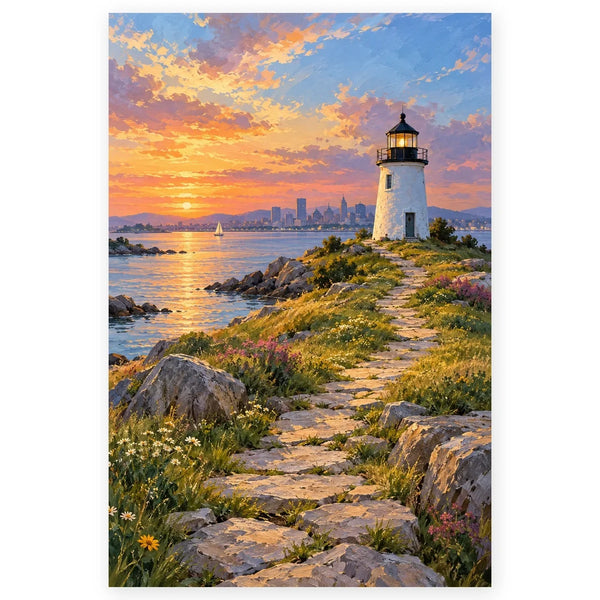
Boston Lighthouse Island Path Paint by Numbers Kit
$29.99

Copenhagen Canal Bicycle Bridge Paint by Numbers Kit
$29.99
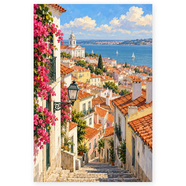
Lisbon Rooftop River View Paint by Numbers Kit
$29.99
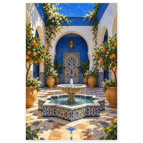
Marrakesh Blue Roof Courtyard Paint by Numbers Kit
$29.99


