Based on 2294 reviews
81%
(1854)
16%
(370)
3%
(68)
0%
(2)
0%
(0)


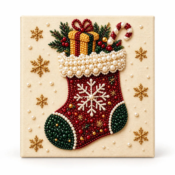
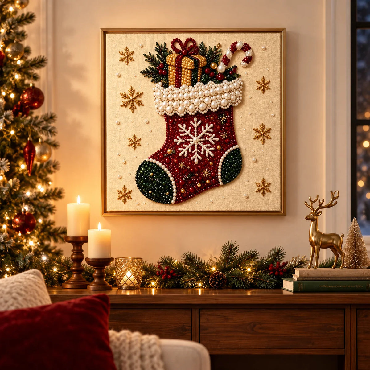
Kit de pintura con diamantes de perlas y calcetín navideño

Designed for a smooth, relaxing project
Enjoy a relaxing project one pearl at a time.
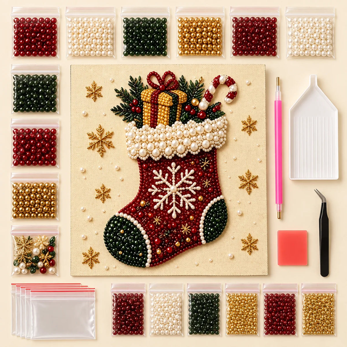
Canvas, color-matched pearls and placement tools included.
Available in 20, 30 and 40 cm square formats.
Shipping options and delivery estimates appear at checkout.
CHRISTMAS PEARL ART
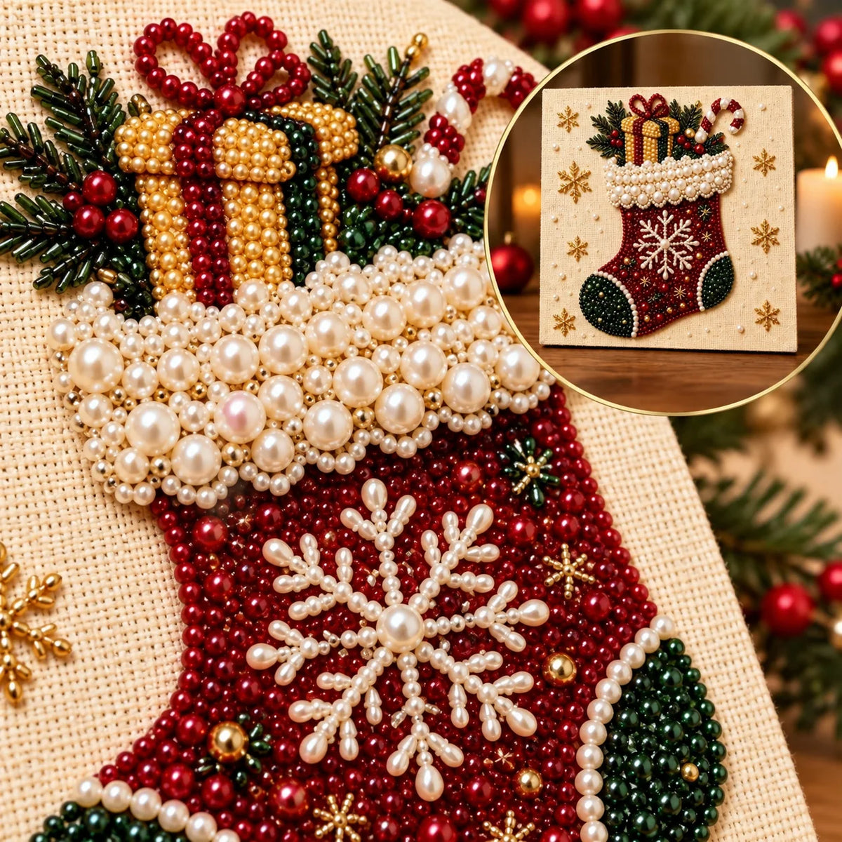
Create sparkling holiday décor with a richly textured Christmas stocking pearl diamond painting. The red-and-green stocking design features a snowflake, gift box, candy cane, evergreen sprigs and dimensional pearl-style beads.
Apply the matching pearl beads to the printed canvas one small area at a time using the included placement tools. This is a DIY craft kit, not a finished artwork; decorative props shown in room scenes are not included.
MADE TO CATCH THE LIGHT
Glossy pearl-style beads give the Christmas Stocking design a raised, light-catching texture. The completed project is a decorative craft result; props shown in room scenes are not included.
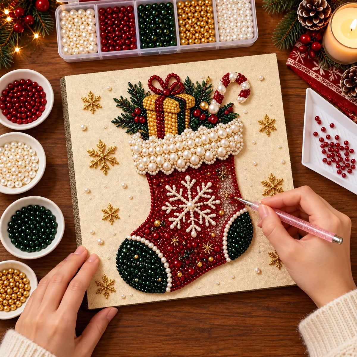
Relaxing to Make
Six Simple Steps
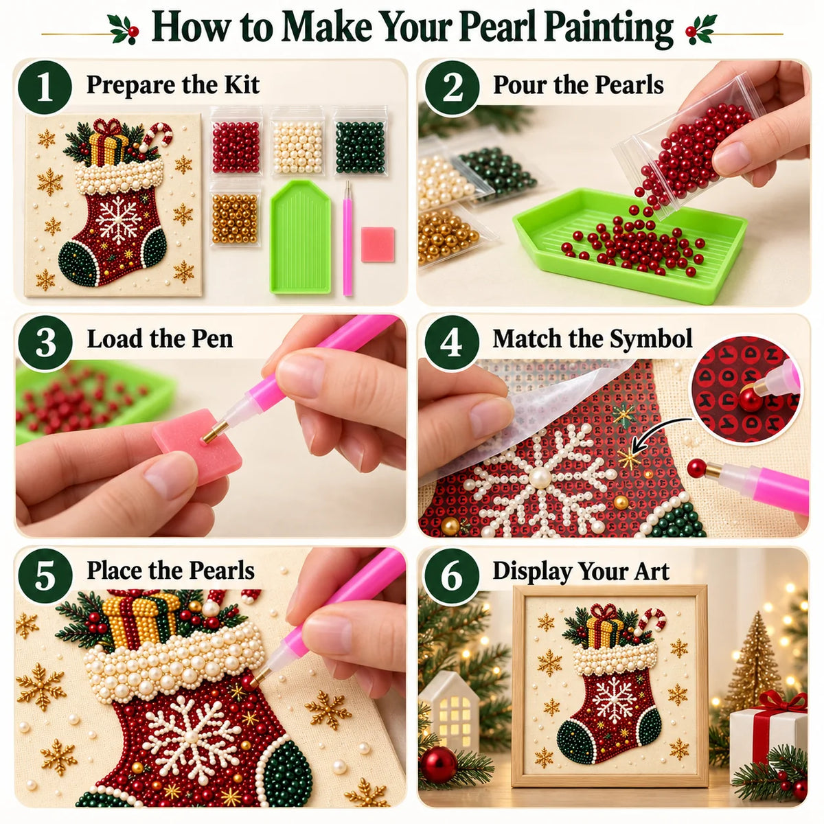
Work on one small area at a time: prepare the kit, sort the pearls, load the applicator pen, match each printed symbol, place the pearls, and display your finished Christmas stocking art.
Ready When You Are
Choose Your Scale
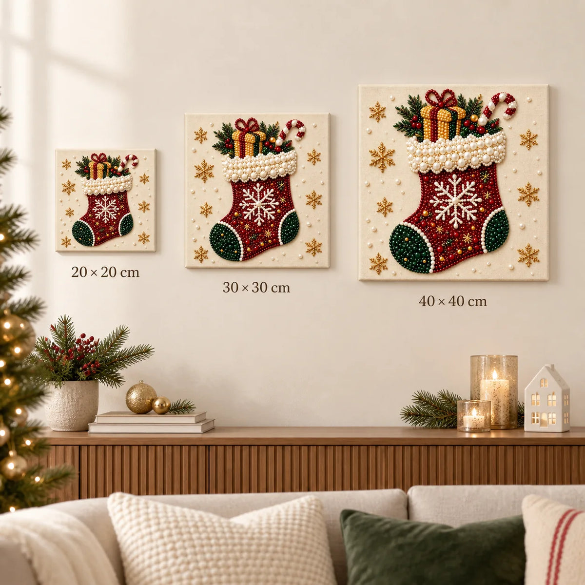
Display It Your Way

I thought the detailed areas would be my favorite, but I also enjoyed the larger blocks of color. They gave me a break between the trickier sections and made progress easier to see. Having both kinds of work kept the project balanced. I could choose an area that suited my energy that evening.
This sunflower ocean piece has enough color movement to stay engaging through the whole project.
This finished sunflower wave looks fresh and warm from afar, and the pearls reward a closer look.
I had trouble keeping the protective sheet out of the way when working close to an edge. After a few adjustments, folding back a smaller area helped. I still enjoyed placing the drills, but that part of the setup felt awkward. Next time I would plan smaller working sections from the beginning instead of opening so much at once.
The stacked city scene has a strong focal point, and the layered buildings, windows, and winding streets keep the surrounding areas interesting.
I liked the ballet artwork because it felt connected to an interest rather than just a pretty pattern. The shoes and ribbons gave me clear shapes to follow, and the softer shades kept the result gentle. I would choose this kind of image for a dance lover who enjoys making something for their own space.
I wanted a design that felt fresh and peaceful, and this rocky coastal home matched that idea well. The clear water, rocks, and a small seaside house gave me enough variety that the process never felt like one long block of the same color. The water shifts through several blue-green tones, and the rocky shoreline gives the scene a natural focal point. I like that it looks decorative without feeling overly busy.
I worked on the snowy village in short sessions, starting with the colorful house fronts. The white rooftops made more sense once those brighter sections were complete. A few snowy areas felt repetitive, so I switched colors when I wanted a change. The cheerful little buildings made it easy to come back to the canvas.
The completed picture gave my shelf a little color without taking over the whole room.
Twenty minutes turned into an hour. Filling those little spaces is more enjoyable than I anticipated.
I waited until the picture was finished before choosing a frame. A simple border turned out to work best because the surface already had plenty of texture. Seeing it on the wall changed how I viewed the project. The little sessions at the table had become something I could enjoy every day.
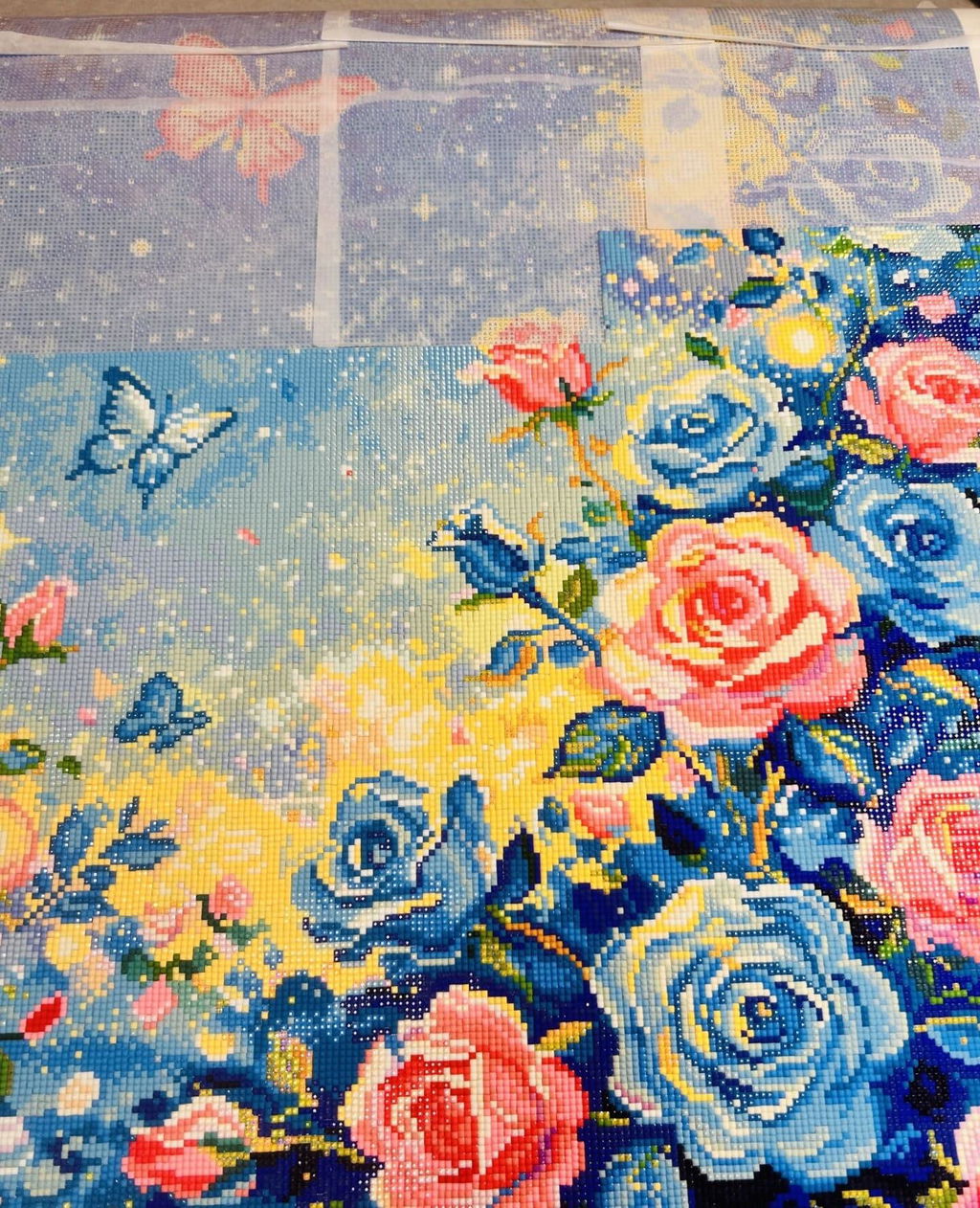
The pearls give the large roses, flowing stems, and layered petals a raised finish that works beautifully on this blue rose bouquet.
The lighter colors needed a little more attention than the dark ones. I could still see some numbers after my first pass, so I let those areas dry before adding another thin coat. That gave me a neater result than trying to cover everything at once. It's worth allowing time for small touch-ups near the end.
Clear print, good adhesive and a useful basic tool kit. The tray is on the small side for the larger color-block sections.
The wave texture close-up is detailed enough to feel special but still easy to appreciate at a glance.
The large-pearl wave feels personal and handmade, especially with the curved rows of oversized pearls and fine bead outlines in place.
The sailing ship comes alive through the tall sails, rolling water, and rope-like lines. The blue, cream, tan, and pearl white palette suits it perfectly.
I am pleased with the outcome. I am a visual person so I attached a photo. There are A LOT of black beads, which to me was the most difficult part.
The layered blues look striking, though several shades are close enough that I had to sort and check them carefully.
The small details reward patience. I liked seeing shapes emerge that weren't obvious in the printed guide.
The large roses, flowing stems, and layered petals kept this blue rose bouquet interesting from one section to the next.
Some tiny numbers were hard to read under my usual lighting. A lamp helped, but those sections stayed slow.
I took a quick photo whenever I put the canvas away. The changes felt small while I was working, but looking back through the photos showed how much had appeared. That was a lovely bonus after a busy week. It gave me a record of the process as well as the finished artwork.
The canvas looked good in a simple frame. I wanted the colors and sparkle to be the main focus.
This sailing ship made a satisfying project to work on a little at a time. Working through the detail made the composition read more clearly every time I stepped back from the canvas. The sail shapes stay clear while the wave pearls add a handmade character. It has the kind of finished texture that encourages people to look more closely.

Make It Gift-Ready 🎁
Add premium gift wrapping to your order for just $8.99 per order.
We’ll carefully wrap your items with thoughtful finishing touches, leave the price off the package, and have it ready to gift the moment it arrives.
Processing: 3–5 business days.
USA, UK, Canada, Australia: 10–21 days.
Most other countries: 15–30 days.
Delivery times are estimates. Shipping costs and available services are calculated at checkout.
Helpful Details
A pearl diamond painting kit is a DIY craft that uses glossy round pearl drills placed onto a pre-printed adhesive canvas. This Kit de pintura con diamantes de perlas y calcetín navideño kit features the artwork shown above.
Yes. Match each pearl color to the printed guide and work on one small section at a time.
The kit includes the printed canvas, color-matched pearl drills and placement tools. Check the product images for the illustrated kit components.
Choose 20 × 20 cm for compact spaces, 30 × 30 cm for a balanced display, or 40 × 40 cm for a larger artwork.
Canvas Only has no support frame. Framed means the canvas is stretched over an inner support frame; it does not include a decorative outer picture frame.
Peel back a small section of film, match each pearl color to the printed symbol and press it gently into place. Keep the finished artwork dry, dust it with a soft cloth and avoid prolonged direct sunlight.
Make it yours
Choose your size, canvas style and quantity.